The Gem
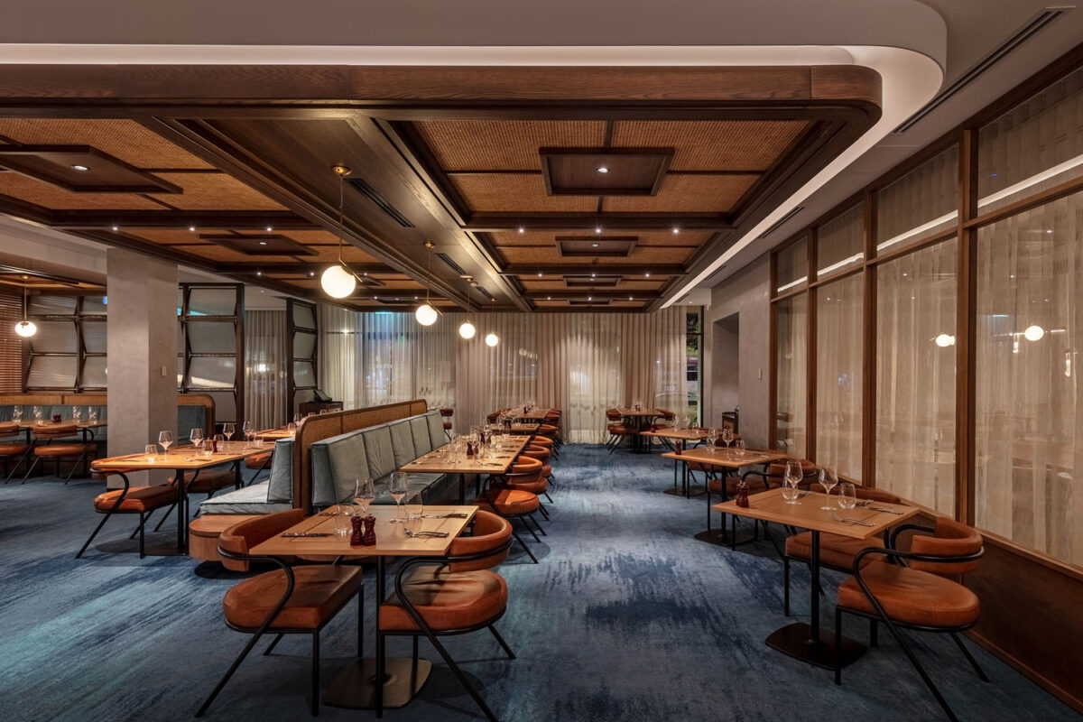
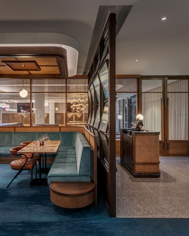
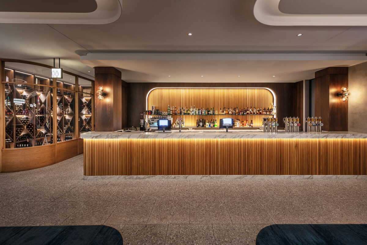
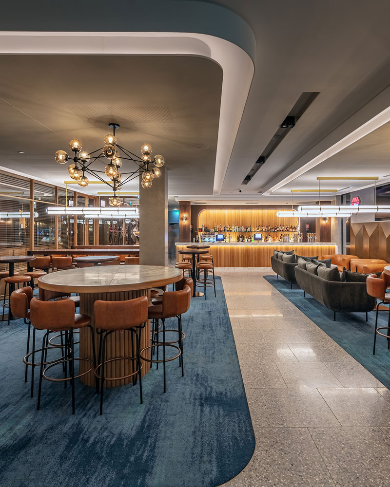
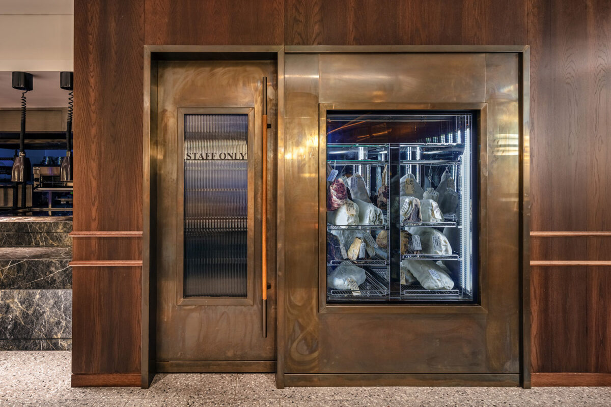
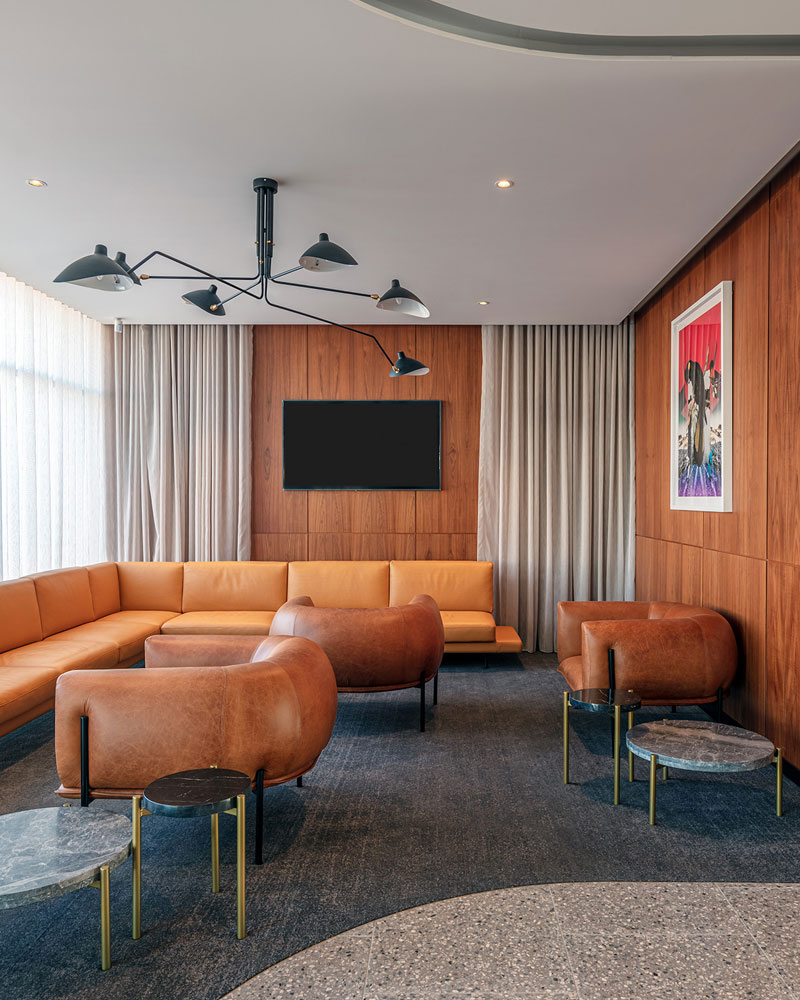
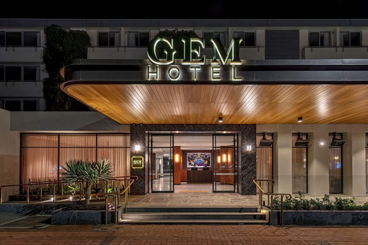
The Gem upgrade derived from strong underlying principles of mid-century design, with subtle 1950’s references to soften some of the hard edge forms. The simplicity that is evident in mid-century design allows the existing and new elements coexist easily.
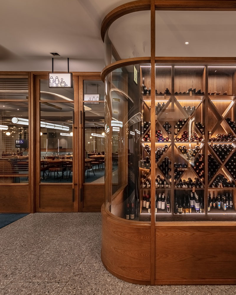
The main bar and restaurant are designed as two complimentary entities, separated by a glazed timber shop front, with continuing reference to a 1950’s aesthetic. With the Italian community being important to the story of modern Griffith, the design approach draws on this vibrant culture and history. Traditional decorative details are paired with contemporary elements to create a unique space.
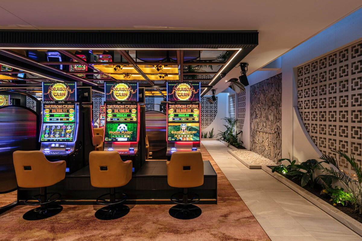
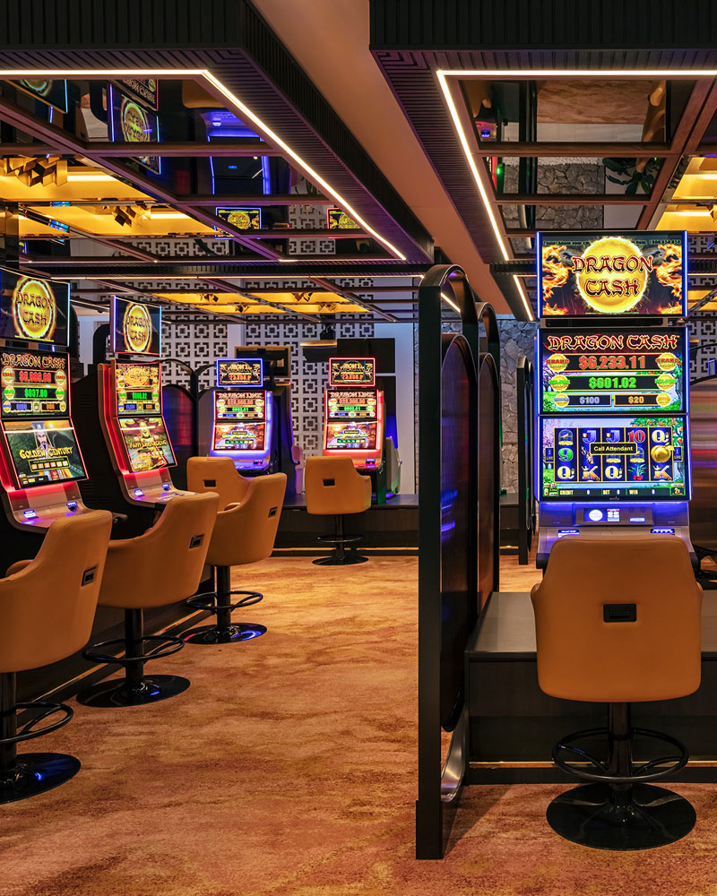
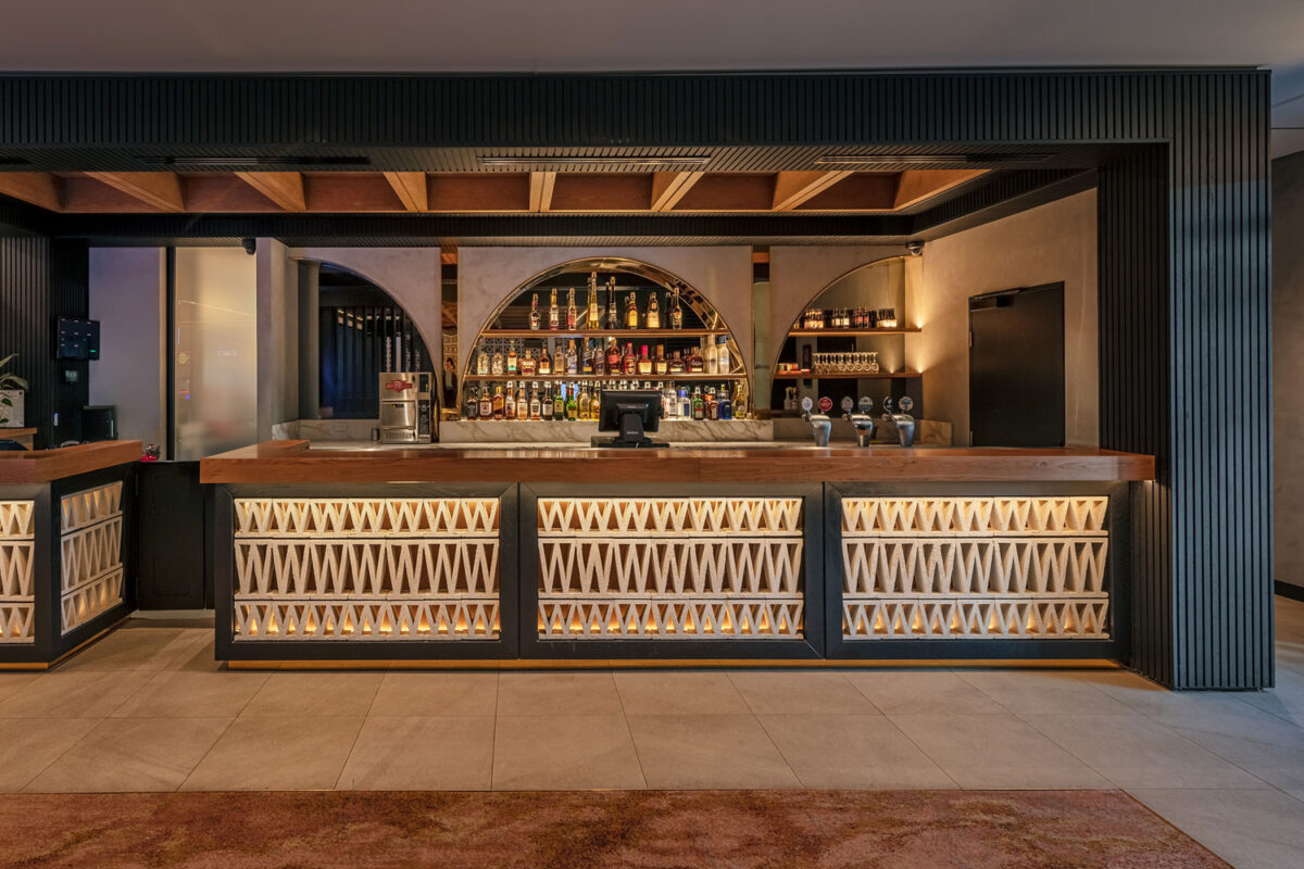
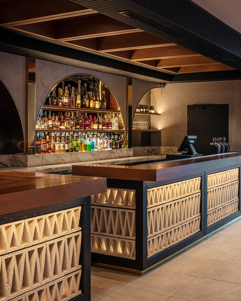
The interiors for the Gaming Room further develop mid-century design principles, with the introduction of breeze blocks and vertical shiplap timber boards. From the outset the intention was to provide a light space with contracting darker tones, featuring gold reflective materials to provide a casino like experience. The result is a dynamic space that features a beverage focused bar and sports entertainment space.
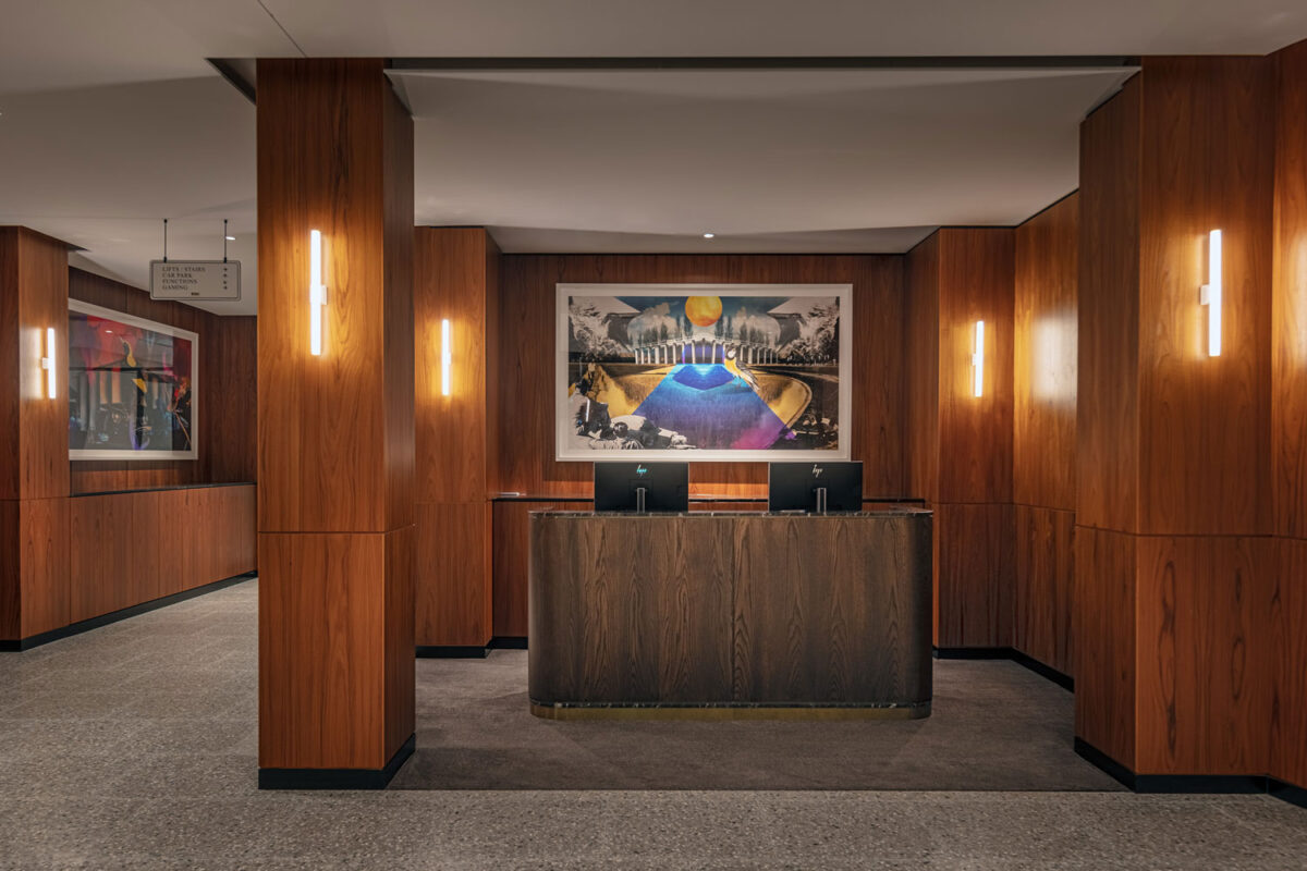
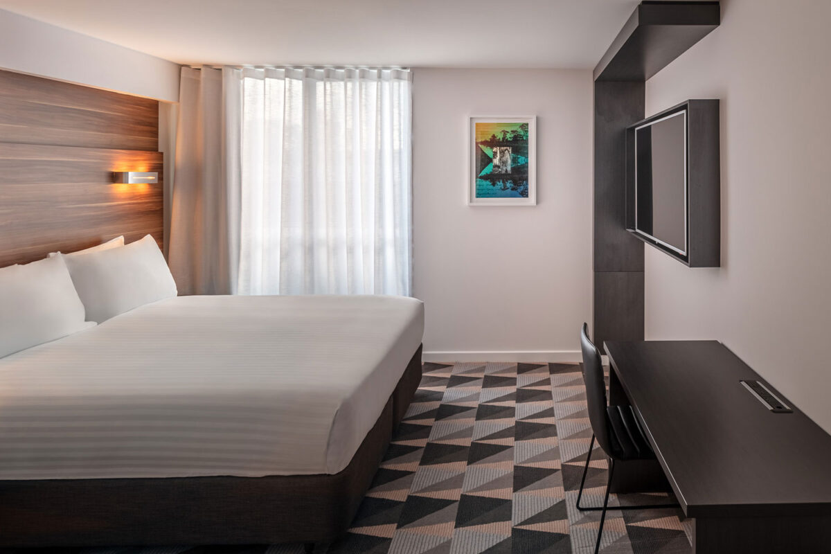
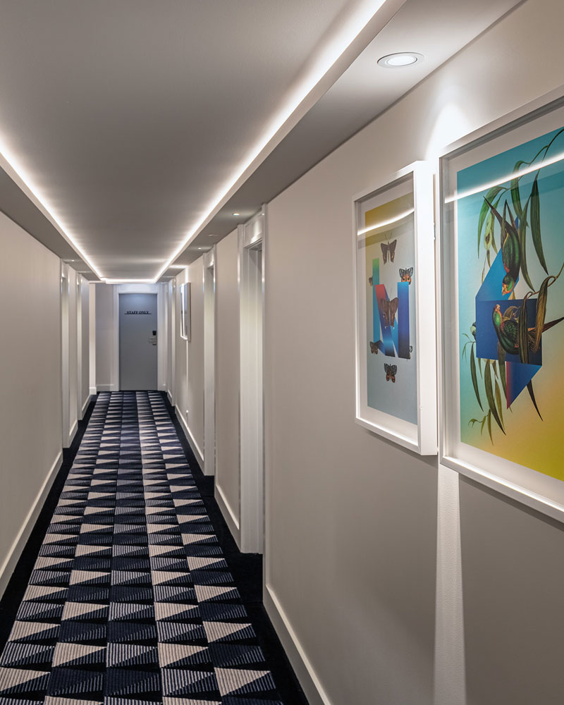
The hotel accommodation features full height timber panelling, warm but subtle tones, and a refined level of detail throughout. Signature design elements flow from the ground floor into the upper level accommodation levels, which introduce a reinterpreted geometric pattern, allowing the introduction of subtle colour variation and unique pattern. Custom artworks, developed by Esem Projects, are displayed throughout the ground floor and upper level room accommodation.
